The Psychology of Brand Colour - How to Choose the Perfect Palette for Your Business
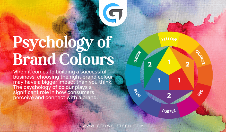
When it comes to building a successful business, choosing the right brand colour may have a bigger impact than you think. The psychology of colour plays a significant role in how consumers perceive and connect with a brand. Whether you’re designing a logo, website, or marketing materials, understanding the power of colour can help you create a cohesive and impactful brand identity. In fact, research has shown that colours can evoke specific emotions and associations, making it crucial to choose a colour palette that aligns with your brand personality and values. So, how do you go about selecting the perfect colour palette for your business?
In this article, we explore the psychology behind brand colours and provide practical tips on how to choose the right palette that resonates with your target audience. By understanding the impact of colour on consumer behaviour and emotions, you’ll be able to create a visual identity that not only captures attention but also builds trust and loyalty with your customers.
The Importance of Brand Colour
Brand Colour is one of the most powerful tools in a marketer’s arsenal. It has the ability to grab attention, evoke emotions, and create a memorable impression. In the world of branding, colour plays a crucial role in shaping how consumers perceive and interact with a brand. When used strategically, colours have the power to communicate a brand’s personality, values, and message.
Research has shown that colour can increase brand recognition by up to 80%. This means that choosing the right colours for your brand can significantly impact how memorable your business is to consumers. Additionally, colour can influence purchasing decisions, with 85% of consumers stating that colour is the primary reason for buying a particular product.
The Power of Colour in Branding
Colour has the ability to evoke emotions, create associations, and influence consumer behaviour. Successful brands understand the power of colour and use it strategically to convey their brand message. Let’s take a look at some case studies of brands that have effectively used colour in their branding:
Coca-Cola is a prime example of a brand that has nailed its colour palette. The use of red in their logo and marketing materials is no accident. Red is associated with energy, excitement, and passion. It grabs attention and stimulates the appetite. By using red, Coca-Cola not only captures attention but also creates a sense of excitement and anticipation around their brand.
Apple is known for its sleek and minimalist design, and their colour choices reflect that. The use of white in their logo and products represents simplicity, purity, and sophistication. White also creates a sense of openness and cleanliness, which aligns with Apple’s brand values of simplicity and ease of use.
Starbucks has built a strong brand identity with its iconic green logo. Green is associated with nature, freshness, and growth. By using green, Starbucks conveys a sense of sustainability and quality. It also creates a calming and relaxing atmosphere, which is perfect for a coffee shop environment.
Understanding Brand Colour Psychology
Colour psychology is the study of how colours affect human behaviour, emotions, and perceptions. Different colours have different meanings and can evoke specific emotions and associations. Understanding these psychological effects can help you strategically choose colours that align with your brand and resonate with your target audience.
For example, warm colours like red, orange, and yellow are often associated with energy, passion, and excitement. These colours can be attention-grabbing and are often used to create a sense of urgency or stimulate appetite. On the other hand, cool colours like blue, green, and purple are often associated with calmness, trust, and reliability. These colours are commonly used by brands that want to convey a sense of professionalism and stability.
The Impact of Different Brand Colour on Emotions and Perception
Different colours can elicit different emotional responses from consumers. Here’s a breakdown of some common colours and the emotions they are associated with:
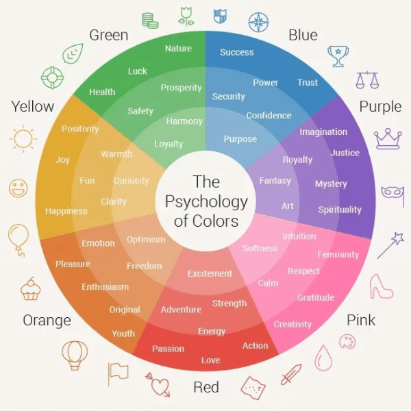
- Red: Red is often associated with passion, energy, and excitement. It can create a sense of urgency and stimulate appetite. This is why many fast-food chains use red in their branding.
- Blue: Blue is associated with calmness, trust, and reliability. It is often used by brands that want to convey a sense of professionalism and dependability. Many financial institutions and tech companies use blue in their logos.
- Green: Green is associated with growth, nature, and health. It is often used by brands that want to convey a sense of sustainability and eco-friendliness. Many organic and natural products use green in their packaging.
- Yellow: Yellow is associated with happiness, optimism, and creativity. It can grab attention and create a sense of excitement. Many brands in the entertainment and creative industries use yellow in their branding.
- Purple: Purple is associated with luxury, creativity, and spirituality. It is often used by brands that want to convey a sense of elegance and sophistication. Many beauty and fashion brands use purple in their branding.
- Orange: Stimulates playfulness, enthusiasm, and vibrancy, commonly used to evoke feelings of energy and vitality.
- Pink: Conveys femininity, romance, and compassion, often associated with love and tenderness.
- Brown: Provides stability, earthiness, and reliability, often used to convey a sense of grounding and warmth.
- Black: Represents elegance, power, and sophistication, often used to convey strength and authority.
- White: Symbolizes purity, cleanliness, and simplicity, often associated with innocence and clarity.
- Grey: Conveys neutrality, balance, and practicality, commonly used to evoke feelings of sophistication and formality.
- Silver: Represents modernity, sophistication, and elegance, often used to convey a sense of refinement and innovation.
How to Choose the Right Brand Colour Palette for Your Brand
Choosing the right colour palette for your brand is a crucial step in creating a strong visual identity. Here are some practical tips to help you select the perfect colours for your business:
- Understand your brand personality: Start by defining your brand’s personality and values. Are you a bold and energetic brand, or do you want to convey a sense of trust and reliability? This will help you determine the right colour family for your brand.
- Consider your target audience: Think about who your target audience is and what colours would resonate with them. Consider their demographics, preferences, and cultural associations. For example, different colours may have different meanings in different cultures.
- Research your competitors: Take a look at what colours your competitors are using and consider how you can differentiate yourself. Look for gaps in the market and choose colours that will help you stand out.
- Test different colour combinations: Experiment with different colour combinations to see how they work together. Consider using colour theory principles like complementary colours or analogous colours to create a harmonious palette.
- Get feedback: Once you have narrowed down your colour choices, get feedback from your target audience. Conduct surveys or focus groups to see how different colours are perceived and which ones resonate the most.
By following these tips, you’ll be able to choose a colour palette that not only aligns with your brand but also resonates with your target audience.
Considerations for Different Industries and Target Audiences
Different industries and target audiences may have specific colour preferences and associations. It’s important to consider these factors when choosing your brand colours. Here are some industry-specific considerations:
- Technology and Finance: In industries like technology and finance, colours like blue and grey are often used to convey a sense of professionalism and trustworthiness.
- Food and Beverage: In the food and beverage industry, colours like red and yellow are commonly used to stimulate appetite and create a sense of excitement.
- Health and Wellness: For brands in the health and wellness industry, colours like green and blue are often used to convey a sense of nature, calmness, and well-being.
- Fashion and Beauty: In the fashion and beauty industry, colours like pink and gold are often used to convey a sense of elegance, luxury, and femininity, appealing to a predominantly female audience.
- Automotive: In the automotive industry, colours like silver, black, and white are commonly associated with sophistication, modernity, and elegance, reflecting the sleek design and cutting-edge technology of vehicles.
- Education: In the education sector, colours like blue and green are often chosen to represent stability, reliability, and growth, fostering a sense of trust and academic success among students and parents.
- Travel and Hospitality: In the travel and hospitality industry, colours like blue and green are used to evoke feelings of relaxation, tranquillity, and adventure, enticing travellers to explore new destinations and unwind in luxurious accommodations.
- Entertainment and Media: In the entertainment and media industry, colours like red and yellow are employed to create excitement, energy, and engagement, captivating audiences and leaving a memorable impression.
- Non-profit Organizations: In the non-profit sector, colours like green and blue are selected to convey trustworthiness, transparency, and integrity, encouraging donors to support meaningful causes and make a positive impact on society.
It’s important to research your specific industry and target audience to ensure that your colour choices align with their expectations and associations.
Case Studies of Successful Brand Colour Effectively
To further illustrate the power of colour in branding, let’s look at some case studies of successful brands that have effectively used colour to create a strong visual identity:
- McDonald’s: McDonald’s uses a combination of red and yellow in its branding to create a sense of urgency and excitement. These colours are known to stimulate appetite and grab attention, making them a perfect fit for a fast-food chain.
- Nike: Nike’s iconic swoosh logo is primarily black, symbolizing power, strength, and sophistication. The use of black reinforces the brand’s image as a leader in athletic performance and excellence, resonating with athletes and sports enthusiasts worldwide.
- FedEx: FedEx uses a combination of purple and orange in its logo, representing reliability, speed, and innovation. The contrasting colours create a sense of energy and excitement, while the purple conveys a sense of trustworthiness and professionalism, making FedEx a standout in the logistics industry.
- Cadbury: Cadbury’s purple branding is instantly recognizable and associated with luxury, indulgence, and quality. The deep purple colour evokes a sense of richness and elegance, aligning perfectly with Cadbury’s positioning as a premium chocolate brand.
- Amazon: Amazon’s simple yet effective use of the colour orange in its logo and branding conveys warmth, friendliness, and approachability. The use of orange highlights the brand’s customer-centric approach and commitment to delivering a seamless shopping experience for its users.
These case studies demonstrate how colour can be strategically used to evoke specific emotions and perceptions, ultimately contributing to the success and differentiation of a brand in the market.
Tools and Resources for Selecting and Creating Brand Colour Palettes
Choosing the right colour palette for your brand can be a daunting task, but there are many tools and resources available to help you. Here are some popular options:
- Adobe Colour: Adobe Colour is a free online tool that allows you to create and explore colour palettes. You can experiment with different colour combinations and even generate colour palettes from images.
- Coolors: Coolors is another online colour palette generator that offers a seamless and intuitive interface. It allows you to create, save, and export colour palettes for your branding needs.
- Colour Hunt: Colour Hunt is a curated collection of beautiful colour palettes created by designers. You can browse through the palettes and find inspiration for your own brand colours.
These tools can help you explore different colour combinations and find the perfect palette for your brand.
Implementing Your Chosen Brand Colour Palette across Marketing Materials
Once you have chosen your brand colours, it’s essential to ensure consistency across all your marketing materials. Consistent use of colours helps build brand recognition and creates a cohesive brand identity. Here are some key areas where you should implement your chosen colour palette:
- Logo and visual assets: Use your brand colours in your logo, icons, and other visual assets to create a strong visual identity.
Website design: Incorporate your brand colours into your website design to create a cohesive and memorable user experience. - Marketing collateral: Use your brand colours in all your marketing collateral, including brochures, flyers, and advertisements.
- Social media: Consistently use your brand colours in your social media posts and profiles to create a recognizable and cohesive brand presence.
By implementing your chosen colour palette across all your marketing materials, you’ll create a consistent and memorable brand experience for your customers.
The Long-Term Effects of Brand Colour on Brand Recognition and Loyalty
Choosing the right brand colours is not just a short-term decision. Your colour palette will have long-term effects on your brand recognition and customer loyalty. When consumers consistently associate your brand with specific colours, it creates a strong and lasting impression. This can lead to increased brand recognition, customer loyalty, and ultimately, higher sales.
It’s important to regularly evaluate and review your brand colours to ensure they continue to resonate with your target audience and align with your evolving brand identity. As your business grows and changes, you may need to tweak your colour palette to stay relevant and maintain a strong brand presence.
In conclusion, the psychology of brand colour is a powerful tool in creating a visual identity that captures attention, conveys your brand personality, and builds trust and loyalty with your customers. By understanding the impact of colour on consumer behaviour and emotions, and by following the practical tips outlined in this article, you’ll be able to choose the perfect colour palette for your business. Remember, colour is not just about aesthetics; it’s about creating a meaningful and impactful brand experience.